It’s an exciting time to be in packaging design, with a new wave of innovation and regulatory changes shaping the landscape.
As retailers navigate the ever-evolving world of private label products, packaging design continues to be a crucial differentiator in capturing consumer attention and loyalty. In 2024, we’re witnessing a dynamic interplay of design elements that redefine the essence of private label packaging. From the nostalgic allure of re-imagined classics to the bold and playful use of hyper contrasts, brands are leveraging design to evoke emotions and tell compelling stories. Complimentary illustrative elements, once seen as mere embellishments, are now integral to creating immersive brand experiences. Meanwhile, the use of brand characters and mascots continues to resonate with consumers, offering a unique avenue for brand-person relationships.
Simultaneously, packaging is becoming a canvas for storytelling, with sourcing narratives and origins taking center stage. Bold shapes and unexpected color choices are breaking traditional norms, inviting consumers to explore products with a sense of curiosity and adventure. The artistry of illustrative work is elevating packaging, blurring the lines between functional packaging and artistic expression. As we delve into the top private label packaging design trends of 2024, it’s evident that packaging is no longer just a vessel for products; it’s a gateway to brand experiences that captivate, engage, and ultimately, drive consumer loyalty.
Nostalgia Meets Modern
One of the main design trends emerging in food packaging for 2024 is the fusion of nostalgia with modern design. By giving classic elements a contemporary twist, brands can evoke feelings of warmth and familiarity. This trend aims to capture a sense of fun, resonating with consumers seeking comfort and nostalgia.
Hyper Contrasts

Another notable design trend for 2024 is the use of hyper contrasts. This approach embraces a ‘more is more’ philosophy to capture consumer attention. It revolves around juxtaposition, using mismatched, highly saturated colors to create a bold and playful look. Brands that embrace this trend can purposefully clash creative elements to leave a strong and impactful impression on consumers.
Discreet but Deluxe
The ‘Discreet but Deluxe’ trend focuses on creating intrigue and allure through intentionally subtle design choices that unfold throughout the unboxing experience. It’s about creating small moments of discovery that keep consumers engaged and enhance the perceived value of the product.
Carrying on from 2023
Carrying over from 2023, we continue to see several design trends that are as popular as ever. These include the use of complimentary illustrative elements, playful patterns and depictions of food, storytelling through sourcing, bold shapes, unexpected color choices, and the enduring appeal of brand characters and mascots. These trends remain effective in capturing consumer attention and creating memorable brand experiences.
Complimentary Illustrative Elements
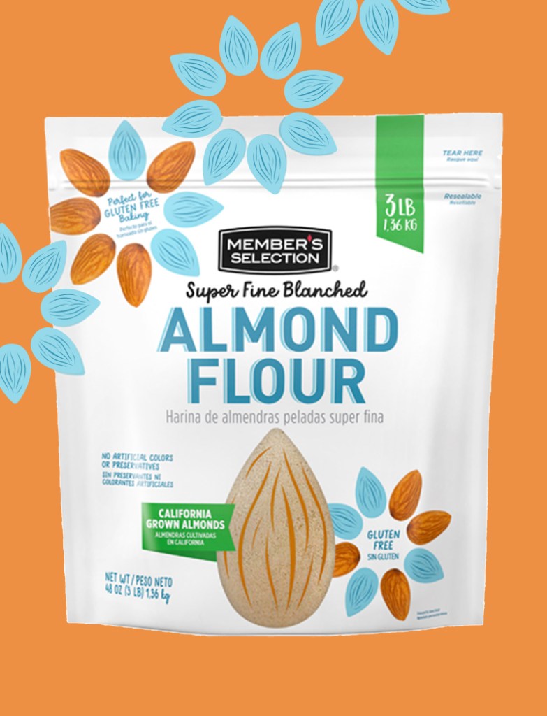
MBD designed the Member’s Se-lection brand to communicate high quality, trustworthiness, and afford-ability. This design exudes appetite appeal, speaking to customers in a friendly, fresh, and inviting manner. The window showcases the product, and playful hand-drawn illustrations add an original twist. The tone is inviting, bright, and cheerful, making it easy to distinguish in the club.
Playful use of Patterns with Food
The playful use of patterns on food packaging continues to be a prominent trend, adding a touch of whimsy and charm to product presentation. Brands are leveraging patterns to create visually appealing packaging that stands out on shelves and resonates with consumers. Whether it’s bold geometric shapes, lively il-lustrations, or intricate designs, these patterns add depth and character to packaging, enhancing the overall brand experience and drawing consumers in with their delightful and engaging aesthetics.
Sourcing Storytelling
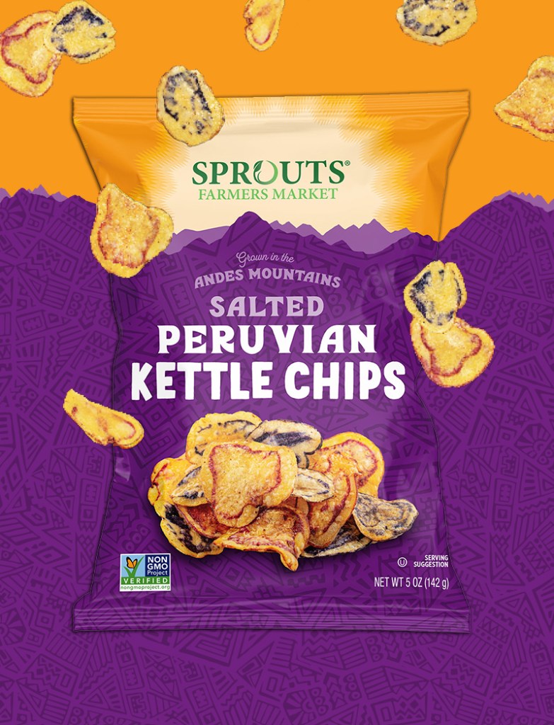
MBD set out to create an ‘Andes Mountain range’ look, tone, and feel for this Sprouts Farmer’s Market chip packaging. The sunshine rising in the back brings light and positivity, complemented by an Inca-inspired subtle illustration in the mountain range, mimicking a traditional Peruvian pattern for storytelling. The hero of the concept is the photography, showcasing the gorgeous Andes Mountains-grown chips. This packaging thoughtfully celebrates the unique-ness of these chips with its carefully designed concept.
Beautiful Illustrative Work
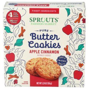
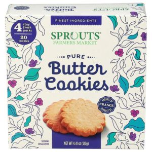
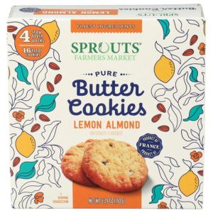
Infusing a beautiful and whimsical illustration style into the butter cookies design helped to not only elevate the packaging, but to help sell the upscale cookies ingredient story. The product name pops off the cream in a whimsical yet easy to read font, while the beautiful product photography showcases the product.
Mascots
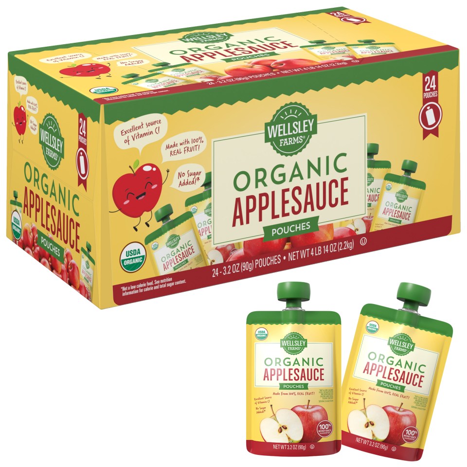
The trend of using mascots or characters on packaging continues to be a powerful strategy, adding personality and creating a memorable brand identity that resonates with consumers. This friendly design for BJ’s Wellsley Farms organic applesauce showcases the pouches, perfect for on-the-go snacks or lunch boxes. The product claims are clearly communicated and playfully highlighted, integrated with a cute character mascot.