Sprouts partnered with Marketing By Design (MBD) to reinvent their brand vision and the results are astonishing! Their private brand program reached sales of $1 billion in 2023, received 8 Awards and was named “Retailer of the Year” at the Vertex Awards Ceremony. Furthermore, the work is strategically thought out and pushes into new territory with category specific, charismatic designs that are disrupting shelves. This redesign speaks to their existing customers who are already accustomed to the high level of quality and innovation expected from Sprouts and it’s relatable and approachable to new shoppers – attracting customers of all ages.
Together with Sprouts, MBD created a look that elevates customers’ expectations and generates excitement around new products and flavors. Overall, it is wholesome, optimistic, innovative, really fun to shop and highlights the differentiated assortment of products you will find in store. We are excited to share the thought process behind some of these designs.
More importantly, our CHI (client happiness index) is a 12 out of 10!
“MBD’s creative talent base never ceases to amaze us. They deliver on time, on budget, and on strategy. Their partnership was essential to the success of what we set out to accomplish. Stay tuned for future growth and more great packaging design from MBD and Sprouts!”
Elizabeth Erby, Director, Sprouts Brand, Sprouts Farmers Market
ORGANIC & CONVENTIONAL PASTA & SAUCES
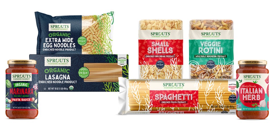
This clever design exudes originality. Organic is meant to look different from conventional and have a more premium vibe, but play nicely with the conventional skus creating a cohesive on-shelf story. Playful, earthy elements crawl up the pack, highlighting the pasta through the window. The claim ‘Product of Italy’ takes center stage in a mature stamp-like graphic, emphasizing the premium quality. The unexpected color stories separate the 2 designs while the illustrations and Italian inspired fonts tie them together.
ORGANIC SPICES
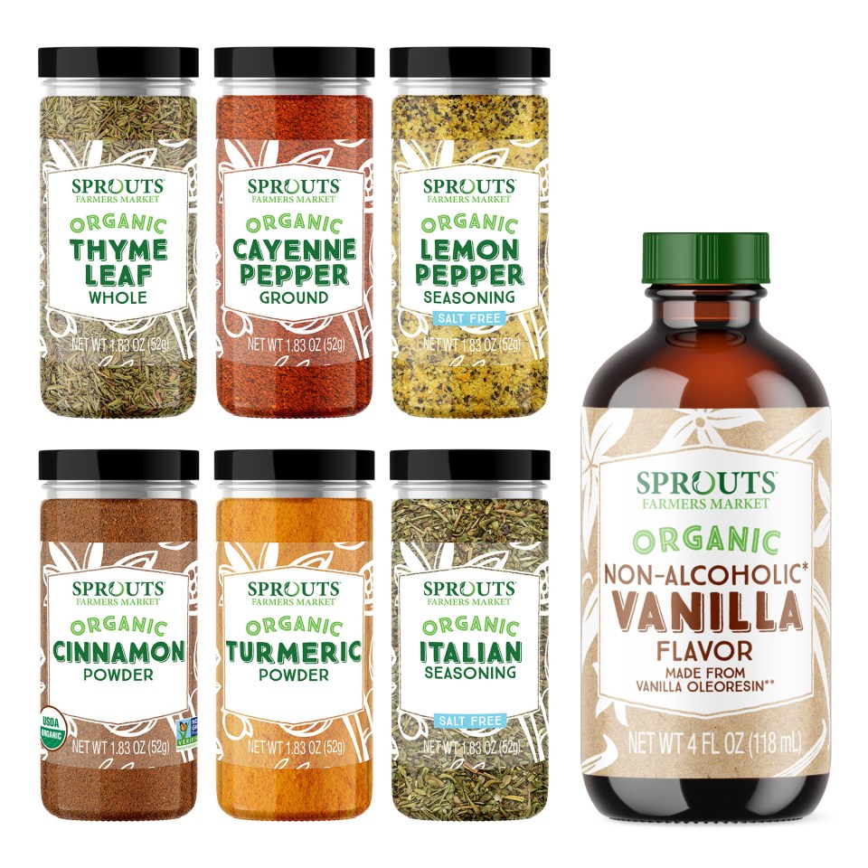
The challenge was to design a system for 52 skus of Organic Spices that could easily be rolled out and drive shelf presence. The solution is one clean, yet confident look to create a dominating brand block. Visibility of product is key, achieved through a clever and ambiguous illustration that wraps around the clear label. Product name pops off the white placard with a bold font for easy legibility.
NON-DAIRY FROZEN DESSERT
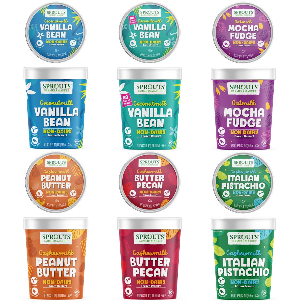
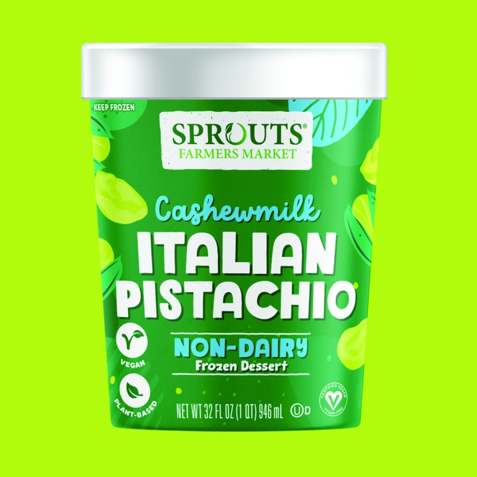
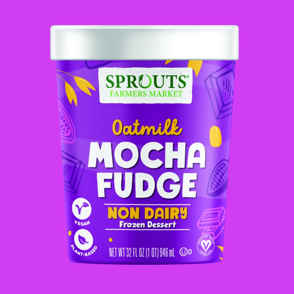
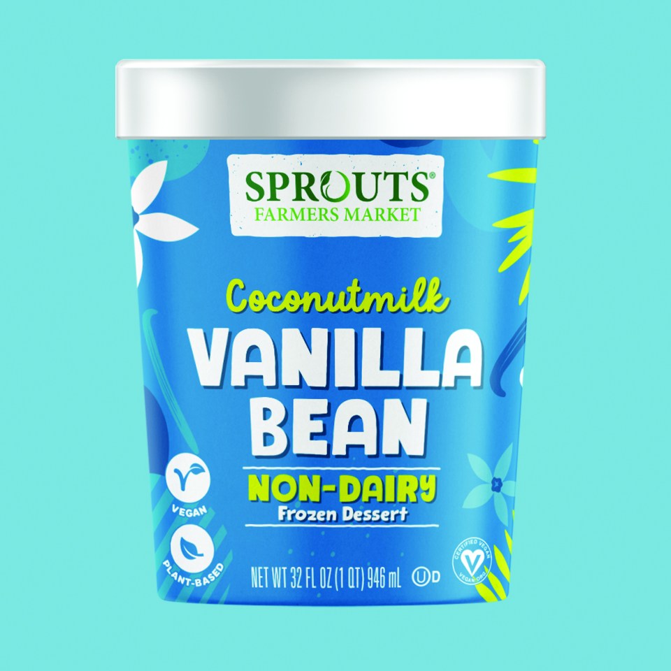
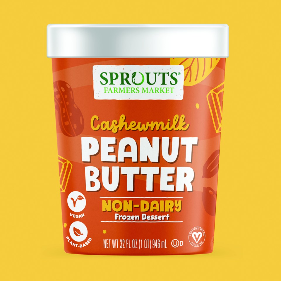
While disrupting an already busy shelf set, this design is the heart and soul of who Sprouts is. The vibrant colors and titles create great shelf impact while the charmful illustrations speak to the “ingredient ques” helping to differentiate the varieties. Claims are clear, easy to read and speak to Sprouts clean and conscious consumer.
ORGANIC & CONVENTIONAL CANNED TOMATOES
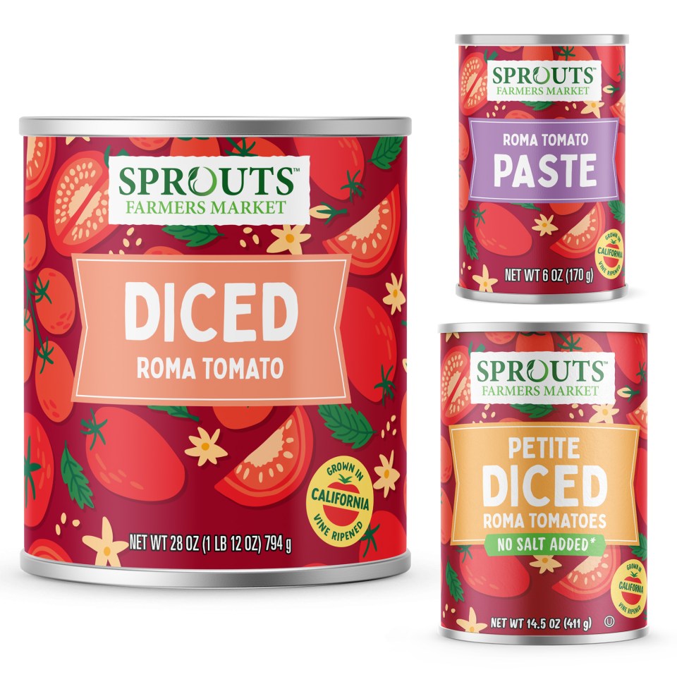
When MBD was asked to create a premium design that was easily shoppable and stood out among national competitors, we couldn’t wait to create packaging that came alive on shelf. Through color and illustrative artistry, the 2 segments are visually different, yet still have a cohesive brand presence – giving this commodity item more meaning.
ORGANIC SUPERFOODS
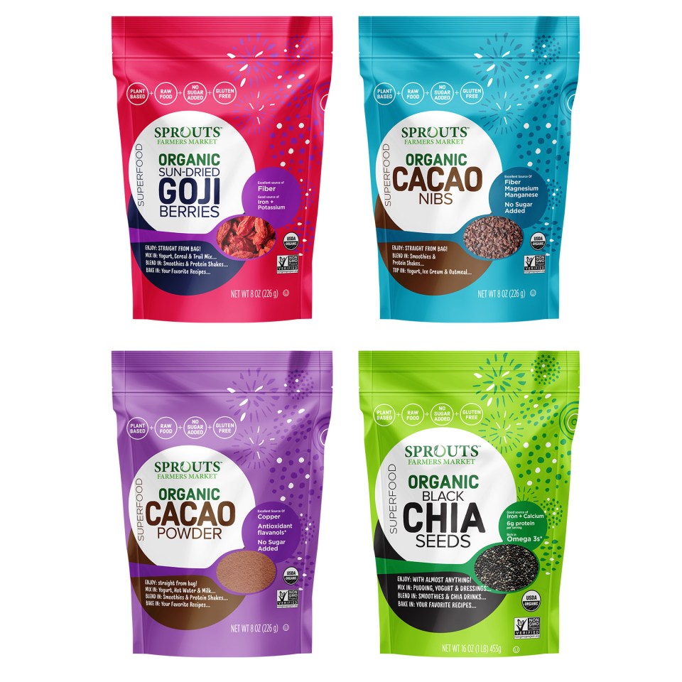
Expressive and exciting, moving the needle in the on-trend superfood category this packaging speaks to the good-for-you benefits present in all Sprouts branded products. The firework-esque design elements highlight the ‘superfood!’ goodness in an approachable way.
FRESH PASTA
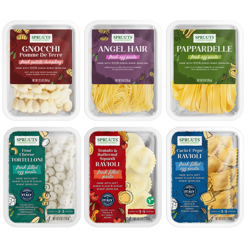
To shake up the fresh pasta category MBD chose earth toned colors with pops of black to provide a premium look allowing the information architecture to be clear, while the half window allows the product to be hero. The titles focus on the pasta form for all skus, while icons speak to the attributes. The illustrations enhance the flavor profiles breathing life into this premium design. The contrasting font helps the concept to be high end looking while maintaining the Sprouts brand look and feel.
ORGANIC COCONUT WATER
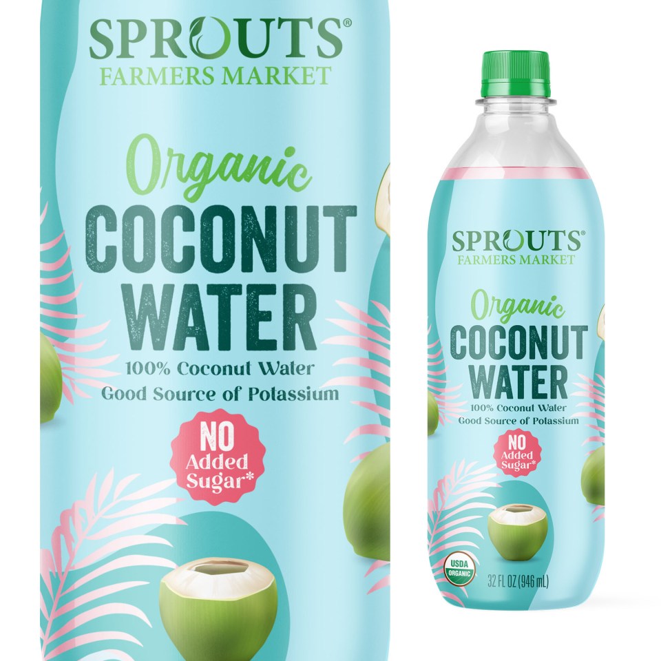
MBD had so much fun with this design. Bursting with personality and inspired by the coconut origin, carefully thought-out fonts and tropical leaf shaped windows allow transparency and highlights the freshness of the product. This energetic design speaks to the refreshing hydration of this 100% Organic Coconut Water.